niedziela, 15 czerwca 2014

http://www.packagingoftheworld.com/2014/04/bigelow-tea-rebrand-student-project.html


Bigelow Tea Rebrand (Student Project)

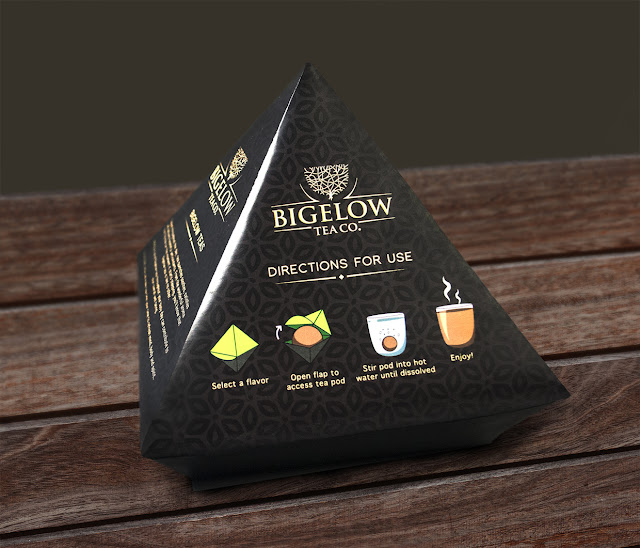
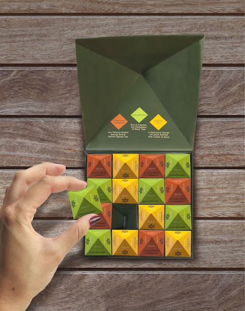
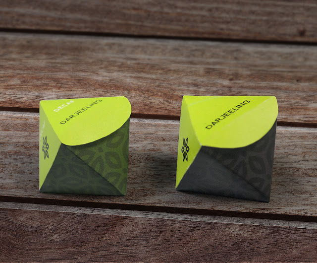
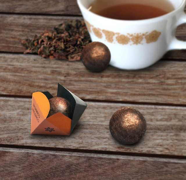
My assignment was to reinvent the Bigelow brand through an innovative product delivery system, introduced in a high-end gift set package and identity. Due to Bigelow's wide target market of 18-60 year olds, I had to create a packaging concept that is fresh and modern, yet classic. The innovative tea concept I developed was Bigelow's signature teas in the form of a dissolvable powder, compacted into a sphere shape. These easy to use 'tea pods' are individually wrapped in colored cubes to represent the three flavors included in the gift set: Constant Comment, Darjeeling and Lemon Lift. I expanded on these diamond-rotated cubes in the gift box construction, resulting in a pyramid inspired structure that is modern and unique compared to the competition.


DESIGN OPAKOWAŃ

http://www.packagingoftheworld.com/2014/04/reloaded-student-project.html


Reloaded (Student Project)

Reloaded was created for entry into Recreate Packaging 2014. The challenge was to recreate travel packaging using renewable fibre-based materials from Stora Enso. The design won 3rd place in the competition.

Our focus from the start was in creating packaging for liquid products that would eliminate as many of the plastic components commonly associated with standard packaging. Our chosen products were hand-sanitiser, moisturiser and toothpaste

Our design is made from two parts. An inner container with a barrier coating that is creased to allow the user to squeeze out the liquid. This is housed in a 'cigarette style' casing with a click lock mechanism that keeps the lid locked when closed. There's a triangle of microflute on the inside of the lid that ensures no liquid escapes when the cap is closed. The design creates packaging that is lightweight, compact and provides a brand new user experience.

The graphics reflect the daring and adventurous nature of traveling and are aimed to appeal to the vitality of the user group. Reloaded was chosen as the brand name as it epitomises the invigorating feeling of refreshing after a long journey.


http://www.packagingoftheworld.com/2014/05/nescafe-alarm-cap.html

Nescafé Alarm Cap

NESCAFÉ® embraces consumer maker technologies to quickly design and build 200 limited edition, 3D Printed, Arduino-based NESCAFÉ® Alarm Caps.

Publicis Mexico is proud to present the The Alarm Cap, designed for NESCAFÉ®‘s brand image refresh. This is the first prototype developed by Publicis Innovation Lab in collaboration with NOTlabs, the creative studio of Los Angeles based, design inspiration company, NOTCOT Inc. “We are very proud of this first prototype delivered and of what our Lab, and its multi- disciplinary team, is
accomplishing since its establishment as an independent department, just a few months ago,” says Héctor Fernández, CEO and General Creative Director at Publicis Mexico.

The Innovation Lab offers brands the possibility to lead the change in the way to interact with consumers. Publicis is the first agency in México to create an inhouse Innovation Lab, combining communication strategy, UX, design and technology. The team is led by Federico de Mateo, Orlando Montiel and Leonardo Corrales.

DESIGN OPAKOWAŃ

http://www.packagingoftheworld.com/2014/05/feltsledge.html

Feltsledge

WHAT IS FELTSLEDGE? 
Feltsledge are designed pads for your Apple® mouse to reduce the friction when moving it. The soft, yet durable material protects both your mouse and the surface beneath it. Feltsledge is especially recomended for designers, architects, extreme gamers and everywhere where precision is required.
\

DESIGN OPAKOWAŃ

http://www.packagingoftheworld.com/2014/06/bella-sewing-notions-concepts.html


Bella Sewing Notions (Concepts)

Playing around in Illustrator, I got an idea for a button card. After the button card I started making other sewing related items just to see how they would look. The pins were tricky because the faces are so tiny. It turned into a fun project.

DESIGN OPAKOWAŃ

http://www.packagingoftheworld.com/2014/06/have-nice-trip-concept.html

Have a nice trip (Concept)

A "Have a nice trip" has been chosen as a winner project in the Recreate Packaging 2014 Design competition. The participants have been challenged to create an innovative packaging solution for beauty care products which is traveler- and environmental-friendly. The flat form of the package fits easily into the suitcase. In addition to this the set can be ordered by online retailer or can be sent via post to the traveler. "Have a nice trip" is simple and easy to use, and also logistically efficient and protects the contents well. The solution could be used not only with a beauty care product family but also can include pharmaceuticals, etc.


DESIGN OPAKOWAŃ

http://www.packagingoftheworld.com/2014/06/ancora-gold.html

Naming, graphic design and art direction project for a launch of a gourmet line of a company of frozen seafood products. The pack's main idea is that although are frozen products, they can be even fresher than the ones of the fish market, that's why in every pack, from a clam's can to a salt pot, the protagonist is raw fresh seafood.


DESIGN OPAKOWAŃ


http://www.packagingoftheworld.com/2014/06/lingua-simplex-language-play-language.html

Lingua Simplex - Language play. Language learning

Design language pairs games for all ages. Both for adults and for children.

Each game pack represents by a character with a typical geographical origin and nationality of their country. Countries which have stereotyped characters, so that each game pack personifies a character for the learning language inside.

By pushing upwards and the other downwards the slip lid of the game boxes. The character-illustrations will be transformed and the character-expressions changed in a funny playful manner, which supports the clichés of the characters.

Learning best in a playful way, because by playing we are known to learn most successfully.

The Design Agency Amelung Design, located in Hamburg, Germany, has won for their packaging design series "Lingua Simplex – Language play. Language learning." the European Design Award. Lingua Simplex was also awarded by the Art Directors Club for Germany in 2014 and are nominated for the German Design Award 2015.

DESIGN OPAKOWAŃ

Małopolska Selection

http://www.packagingoftheworld.com/2014/06/maopolska-selection.html
"Małopolska Selection" is a set of souvenirs commissioned by the Marshal’s Office of the Malopolska Region. We’ve selected over a dozen objects made by local craftsmen, ensuring that each one is authentic, extraordinary and at the same time characteristic for the region. For them we created a set of packaging inspired by the “Cracow Workshops” – a 1913 formed community, aiming at the improvement of the artistic quality of crafts.


DESIGN OPAKOWAŃ
http://www.dexigner.com/news/27505

Pearlfisher Wins FAB and FABulous Grand Prix Awards for Lurpak Slow Churned
Read more: http://www.dexigner.com/news/27505
Pearlfisher Wins FAB and FABulous Grand Prix Awards for Lurpak Slow Churned
Lurpak Slow Churned by Pearlfisher 01

DESIGN OPAKOWAŃ
http://www.dexigner.com/news/27403


NibMor 01
NibMor 02
NibMor 07
NibMor 08